Increasing travel advisor activation from 42% to over 70% by reframing our onboarding experience.
Fora Travel was facing a critical challenge: a low activation rate among new travel advisors. The existing onboarding process, consisting of a basic checklist on the dashboard, failed to engage and guide these new recruits effectively. This case study chronicles the journey of how I redesigned Fora's onboarding flow, transforming it from a passive checklist into an engaging, user-centric experience that propelled advisor activation and set them on a path to success.
Consults
Alex C, Vadim P, Jake P, Yossi M
Problem
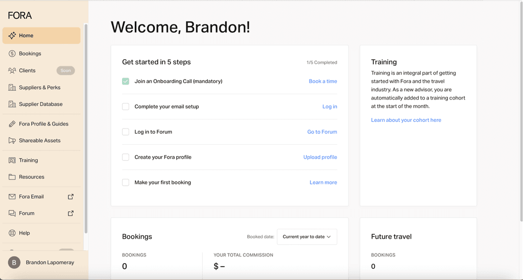
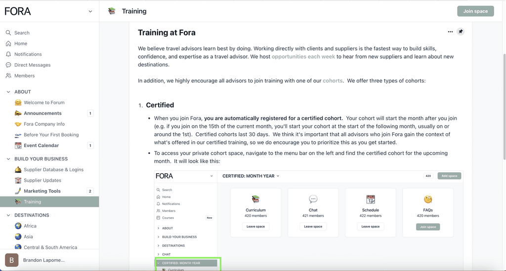
Current Experience
Current onboarding experience
Fora online community
Research & Insights
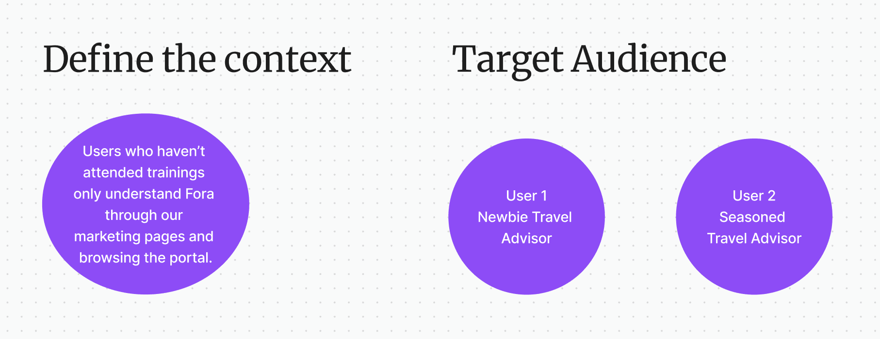
Target Audience
This project centered around newly registered Fora travel advisors, encompassing a diverse group of individuals from experienced professionals transitioning from traditional agencies to those taking their first steps into the world of travel advising. This diverse user base, each with unique needs and expectations, presented a compelling design challenge.
Data Analysis
I began by examining advisor onboarding data, which revealed a sobering 46% activation rate (defined as making the first booking). This figure served as a stark reminder of the existing onboarding flow's inadequacy and highlighted the potential for significant improvement.
Support Feedback
Delving into support inquiries revealed a recurring theme: new advisors frequently contacted support with questions about the onboarding process and platform functionality. This pattern confirmed the presence of pain points and usability issues within the existing experience.
User Interviews
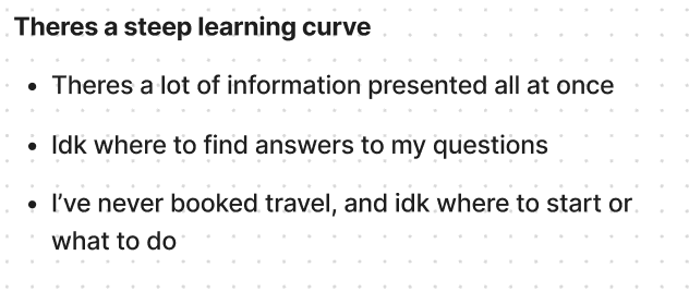
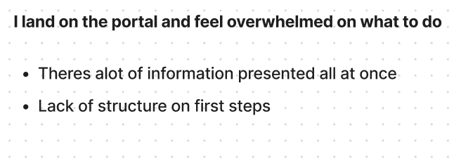
To gain qualitative insights, I conducted in-depth interviews with both seasoned and new advisors. These conversations unearthed common themes and frustrations:
Craving Engagement: Advisors expressed a strong desire for a more engaging and interactive onboarding experience, one that went beyond a passive checklist.
Lost in the Labyrinth: Confusion surrounding the steps required to activate and make that crucial first booking was a recurring pain point.
Navigational Challenges: Navigating the extensive resources available on Fora's platform proved daunting for many new advisors, highlighting the need for improved information architecture and guidance.
Problem Definition
The existing onboarding checklist failed to adequately guide new Fora advisors, resulting in a low activation rate, increased support inquiries, and a sense of overwhelm and confusion.
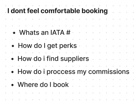
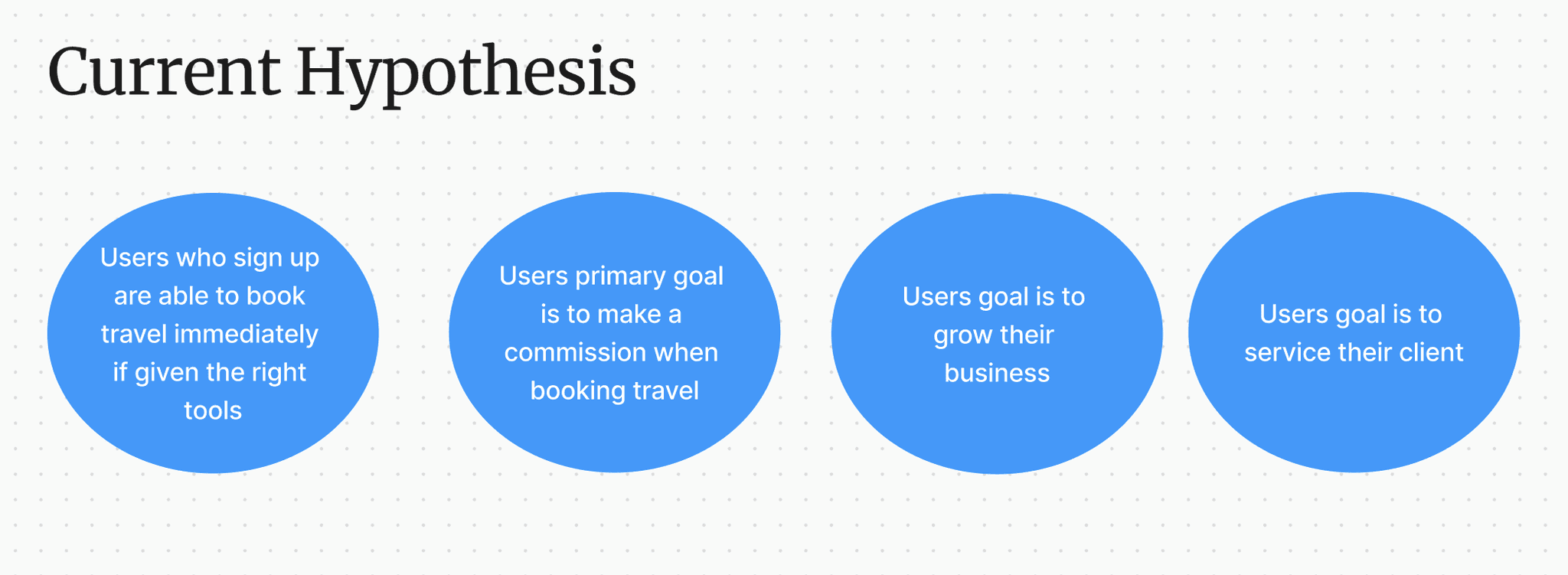
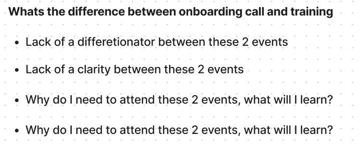
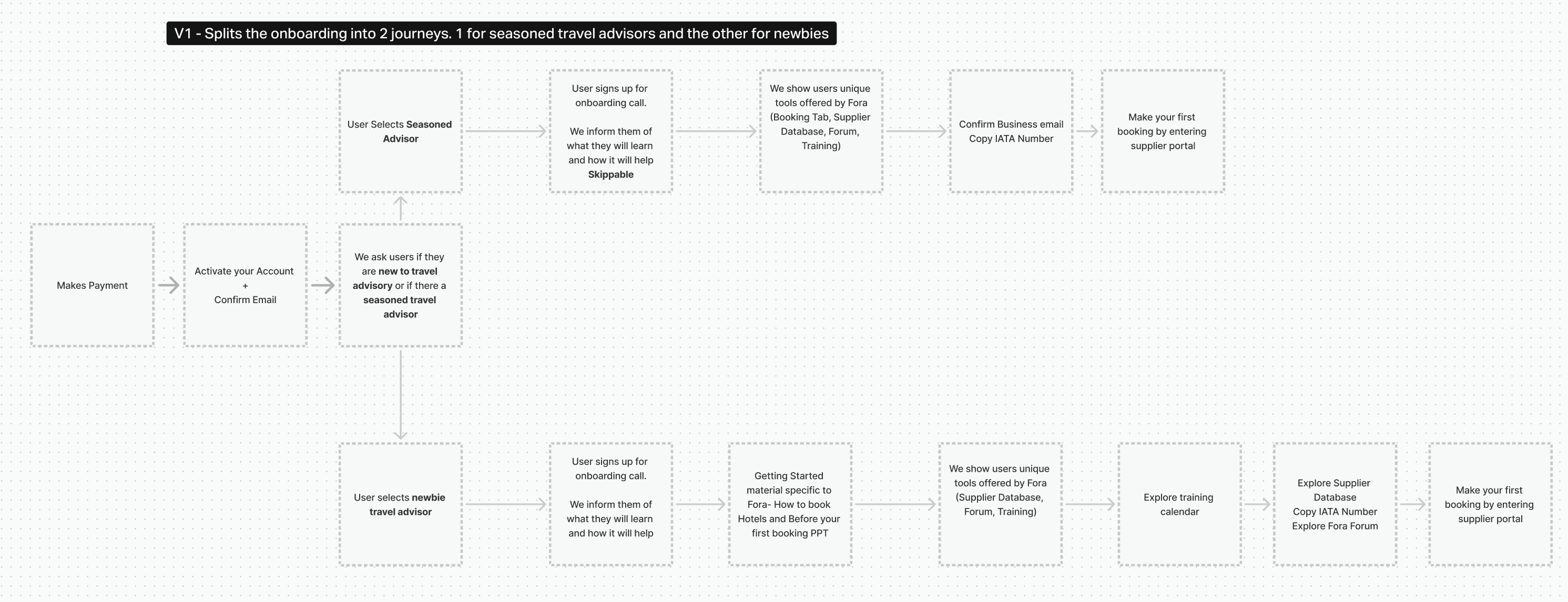
Initially, I envisioned two separate onboarding flows, one tailored to seasoned travel advisors and another for newcomers. I assumed that experienced professionals would find a basic onboarding process redundant and prefer a fast track to Fora's unique offerings. However, user interviews challenged this assumption. I discovered that even seasoned advisors valued a structured introduction to the platform, especially highlighting Fora's unique features and resources. One advisor, who had years of experience at a traditional agency, expressed, "I might know the basics of booking travel, but Fora's platform is entirely new to me. I want to understand how it works, how it's different, and how I can leverage its tools to grow my business." This realization led me to pivot to a unified onboarding experience, ensuring that all advisors, regardless of their background, received a comprehensive introduction to Fora's ecosystem.
User journey mapping two onboarding experiences
Design Goals & Benchmarking
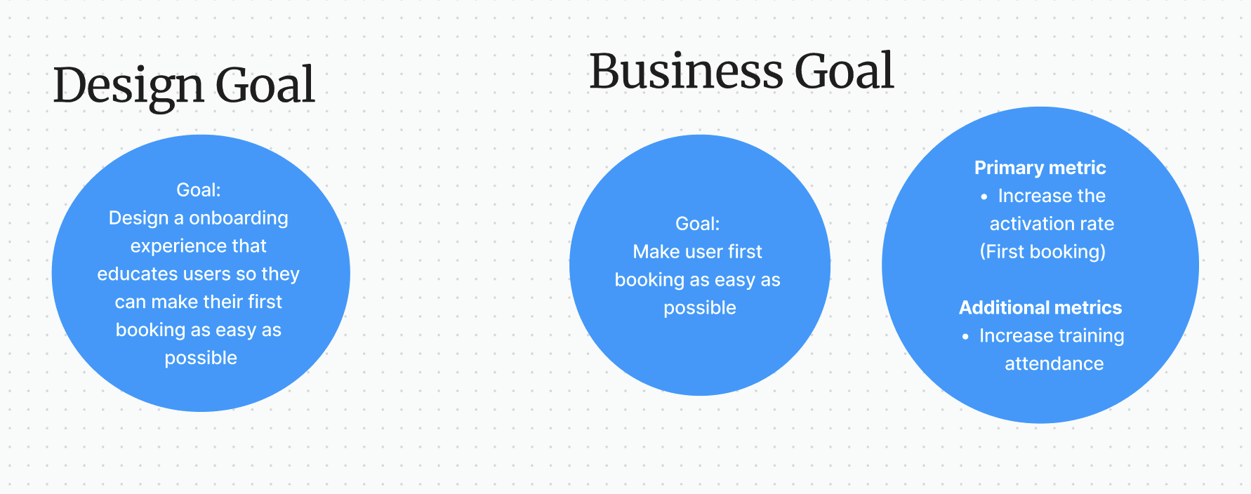
Increase Advisor Activation Rate: Drive new advisors to make their first booking swiftly and effectively, aiming for a significant increase from the baseline 46%.
Improve Onboarding Completion Rate: Create a more engaging and user-friendly experience that motivates advisors to complete all the essential onboarding steps.
Enroll advisors into training: Increase onboarding calls and training attendance by limiting scheduling conflicts and choice in enrollment.
Reduce Support Inquiries: Provide clear, concise guidance and readily accessible resources to minimize advisor confusion and alleviate the burden on the support team.
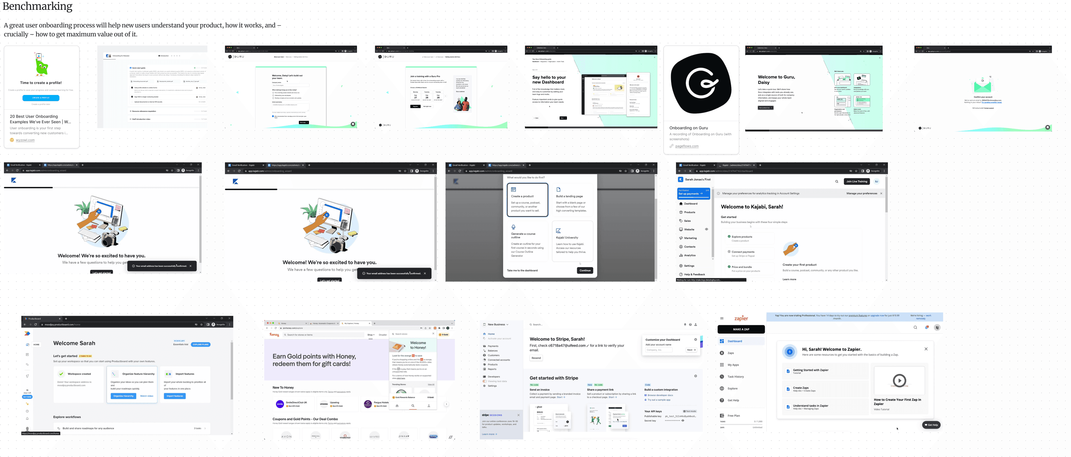
Design benchmarking with Mobbin
Design Solutions
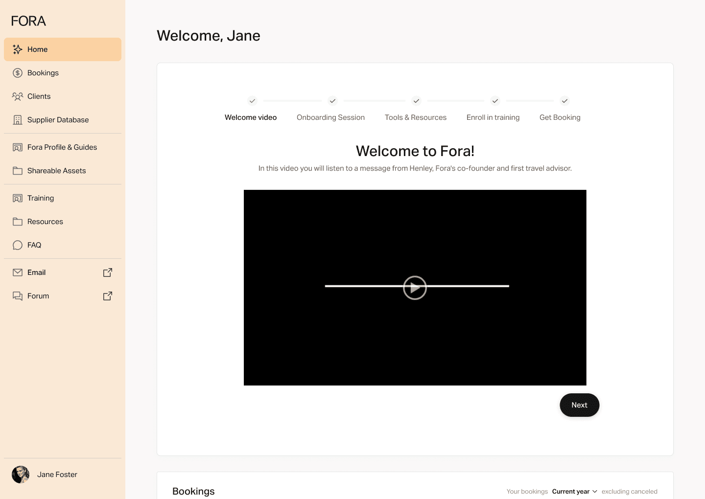
I crafted a reimagined onboarding flow, embracing a gamified approach that incorporated a clear, step-by-step structure with visual progress indicators. These elements aimed to motivate advisors and provide a sense of accomplishment as they progressed. The key features of the redesigned flow included:
Welcome Video
A personalized welcome message delivered by Fora's co-founder, introducing the platform, its values, and the exciting opportunities that lay ahead for new advisors.
Welcome video
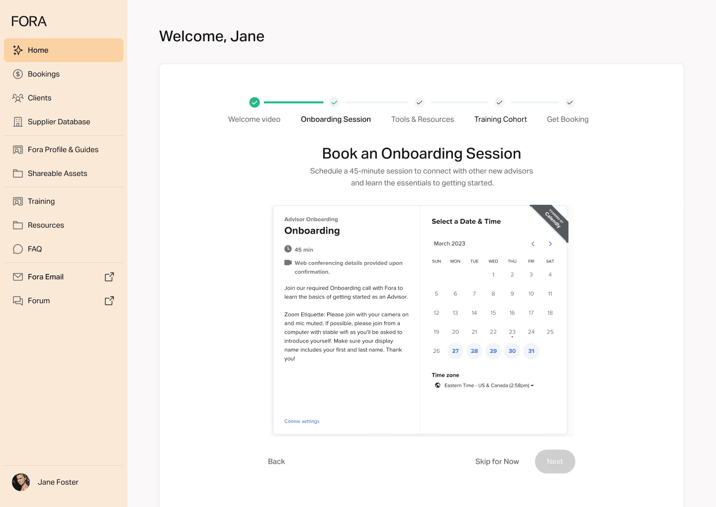
Simplified Scheduling:
A seamless Calendly integration allowed advisors to effortlessly schedule their onboarding call without leaving the dashboard. This minimized friction and encouraged prompt engagement with the Fora team.
Sign up for onboarding session
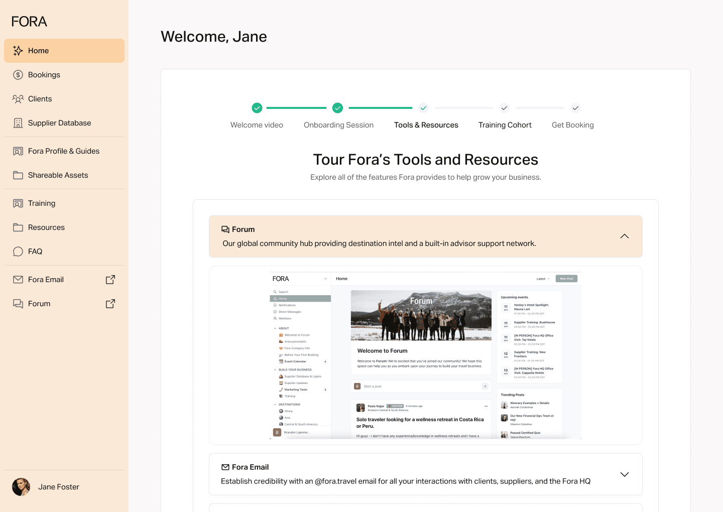
Interactive Tools & Resources Tour
I replaced the static checklist with an interactive accordion-style presentation, showcasing Fora's key tools and resources in a concise and digestible manner. This approach empowered advisors to explore features at their own pace, focusing on the elements most relevant to their needs.
Fora’s tools and resouces
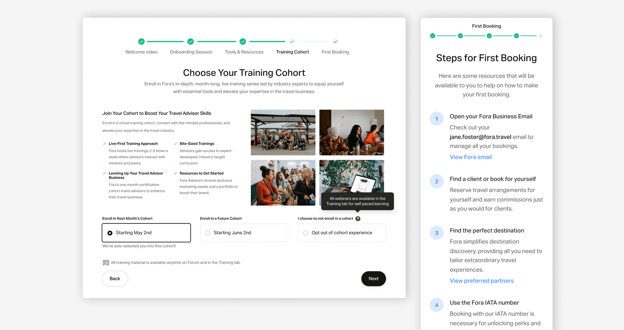
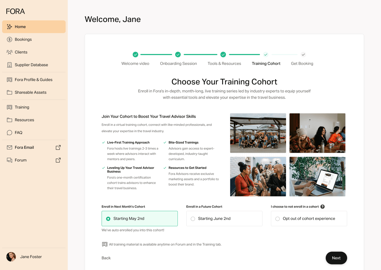
Intentional Training Enrollment
Advisors could now actively choose their preferred training cohort and opt out of live training if desired. This emphasized user agency and addressed frustrations associated with the previous auto-enrollment system where we auto enrolled advisors into the next available cohort.
Enroll in a training cohort
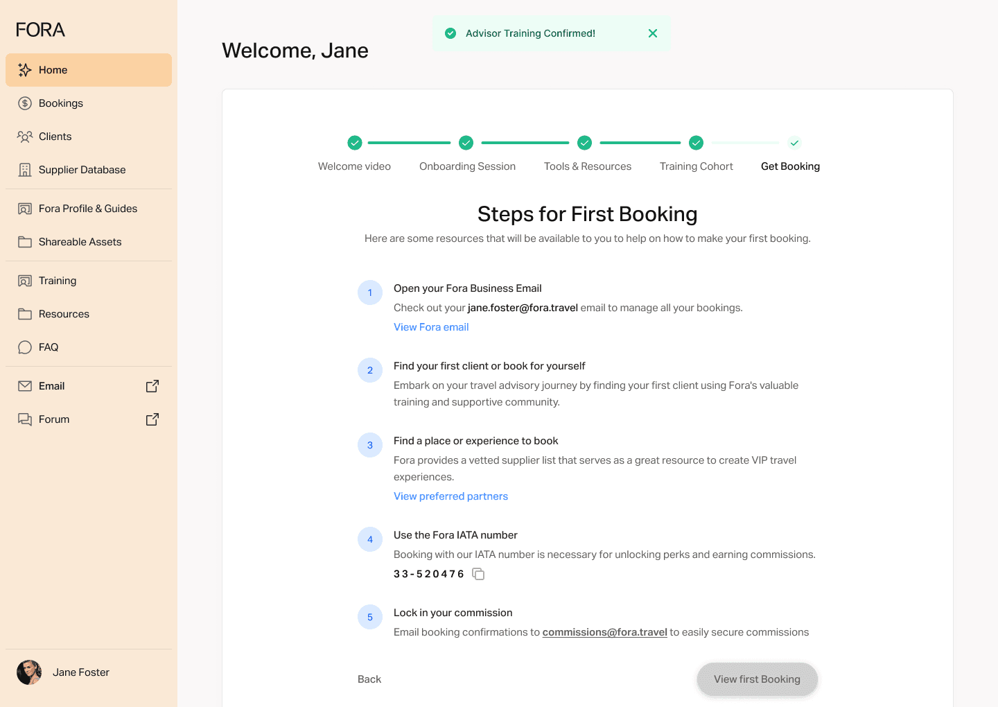
Steps for First Booking
Lastly, actionable steps for making the first booking remained persistently visible on the home page until the advisor activated. This served as a constant reminder and guide, nudging advisors toward that crucial milestone.`
Steps for first booking
Centralized Dashboard Widgets:
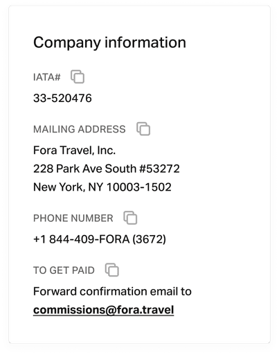
I created a dedicated "Company Information" widget, grouping essential advisor information like the IATA number, mailing address, and commissions email. This centralized presentation provided access to vital details.
Usability Testing
During usability testing, we observed an unexpected pattern: several advisors, including Carol, struggled to locate the back button within the onboarding flow. Initially, I were confused. The back button was clearly visible in the bottom left corner of the module. But through observation and user feedback, we realized our mistake. The button's placement, while logically sound, was visually overshadowed by the prominent "Next" button on the right. This created a visual hierarchy that unintentionally guided users forward, even when they wanted to revisit a previous step. This seemingly minor detail had a noticeable impact on user experience, highlighting the importance of considering visual hierarchy and user expectations in interface design. My solution was simple yet effective: we increased the visual prominence of the back button, ensuring it received equal visual weight to the "Next" button.
Completion Clarity: I added a clear indication of the onboarding flow's completion, addressing Verena's concern about not knowing when the process ended.
Training Expectations: I clarified the dates and expectations for training cohorts, ensuring that advisors understood the commitment involved and felt confident in their choice.
Reducing Pressure: I renamed the "Get Booking" step to "Steps for First Booking," alleviating pressure on new advisors and framing the final stage as a helpful guide rather than a directive.
Development & Implementation:
Close collaboration between design and engineering teams ensured a smooth and efficient implementation process. We prioritized core features for the initial release, scheduling nice to haves elements like an interactive page that educates advisors on other Fora offerings when there are no bookings to show.
Business Impact
Increased Activation Rate: We achieved a resounding success, exceeding our target activation rate of 70% of advisors enabled within 6 months. New advisors were making their first bookings faster and more efficiently than ever before.
Improved Onboarding Completion Rate: Advisors were motivated to complete the necessary steps, demonstrating a higher level of engagement with the process.
Reduced Support Inquiries: Clearer guidance and centralized resources significantly reduced the volume of support tickets related to onboarding and platform functionality. This freed up the support team to focus on more complex issues and provided a smoother experience for new advisors.
Key Takeaways
Gamification and Visual Progress
Utilizing gamification principles, such as clear progress bars and checkmarks, enhanced user engagement and motivation, transforming a mundane checklist into a more rewarding experience.
User Choice and Control
Providing users with greater choice and control over their onboarding journey, such as selecting their preferred training cohort, led to increased user satisfaction and reduced feelings of frustration.
Iterative Design and Testing
Continuously testing and iterating based on user feedback proved crucial in refining the onboarding experience, uncovering hidden usability issues, and addressing pain points that weren't initially apparent.
Future Considerations
Further Automation
Automating cohort change notifications and exploring methods to verify email access without user action will further streamline admin tasks and enhance the user experience.
Personalization
Incorporating advisor-specific data, such as preferred travel niches or business goals, could personalize the onboarding flow and recommend relevant resources, tailoring the experience to individual needs.

